
John Dot
Font Design
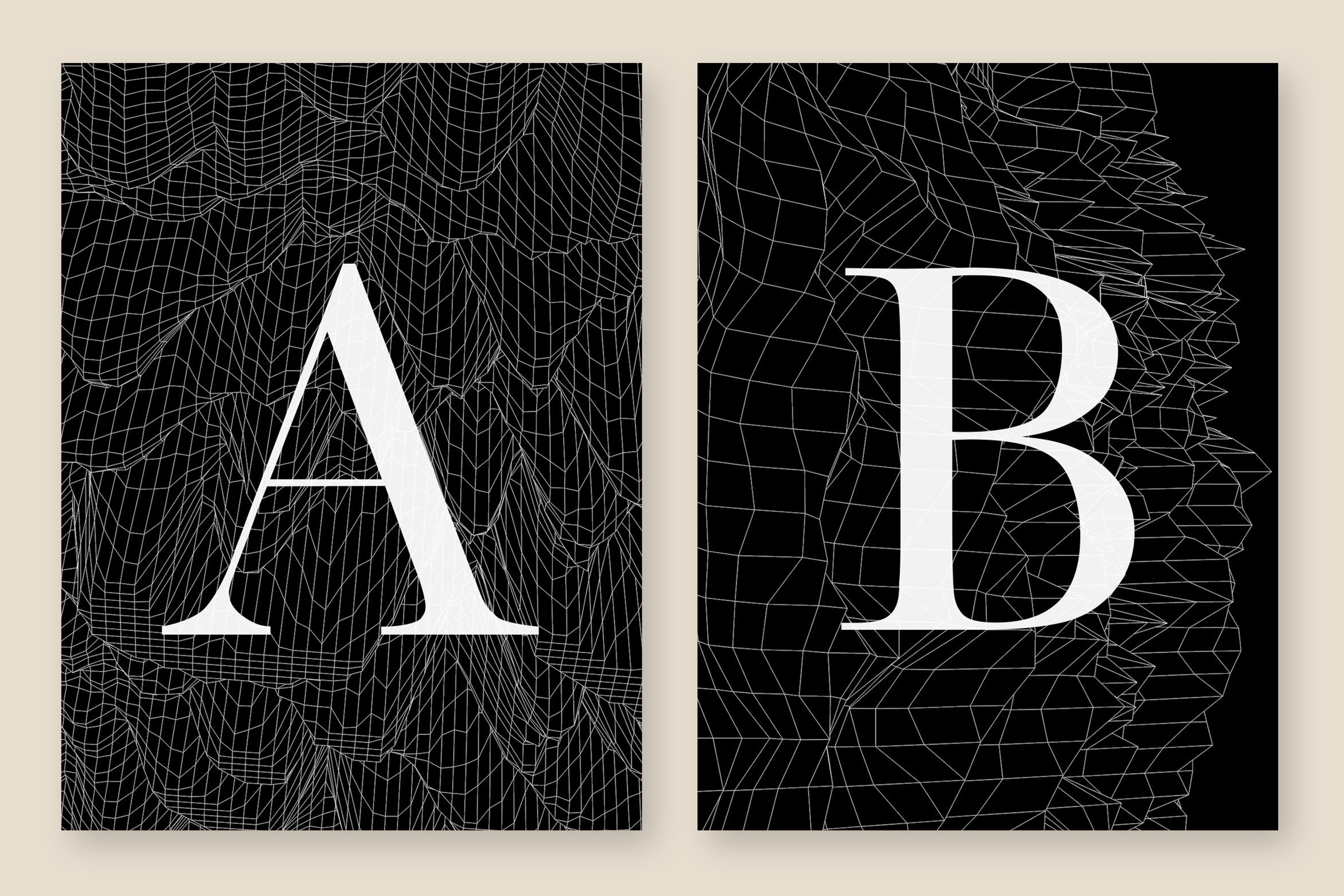
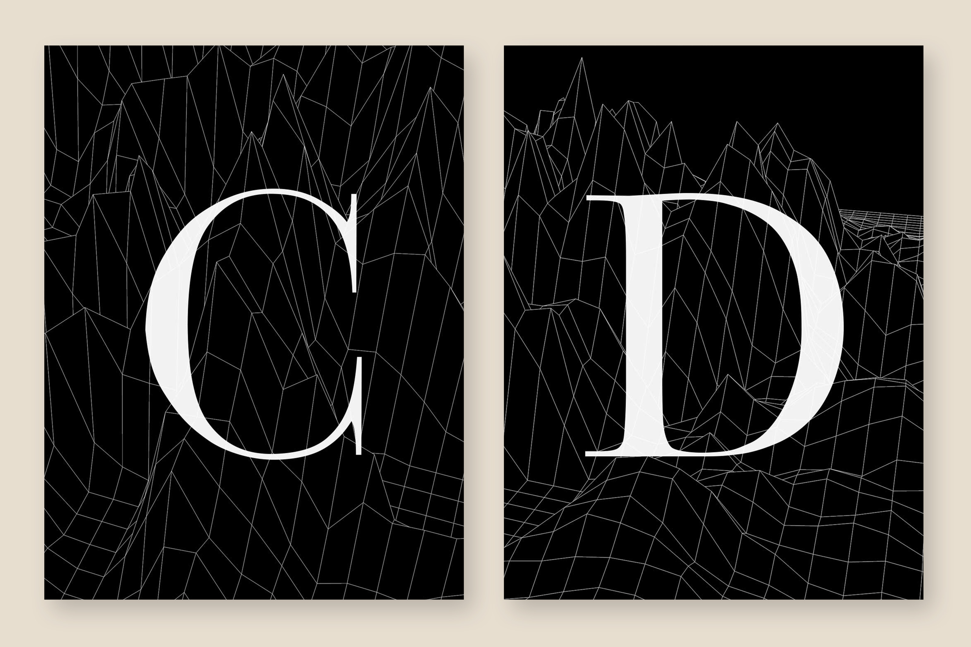
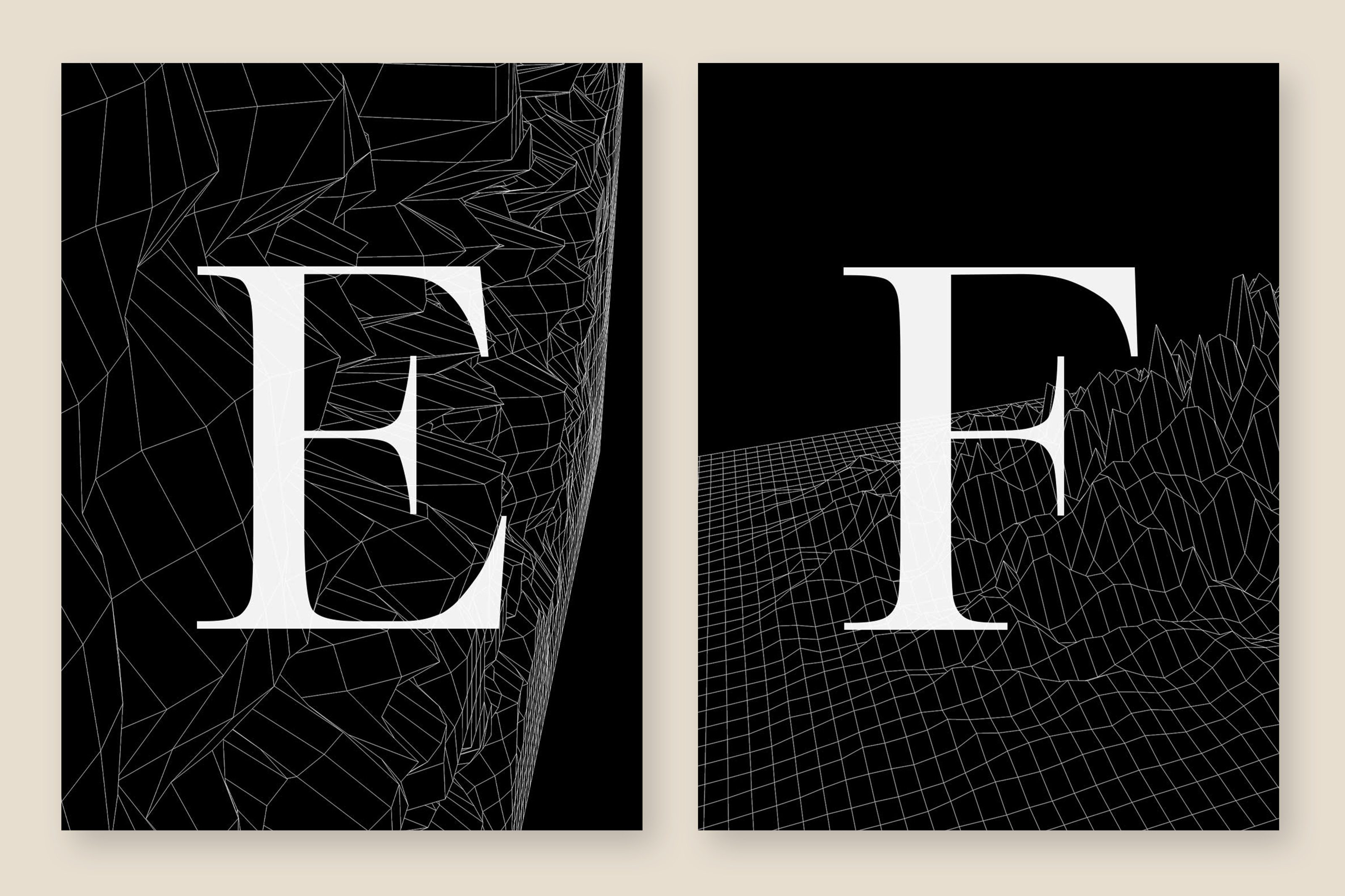
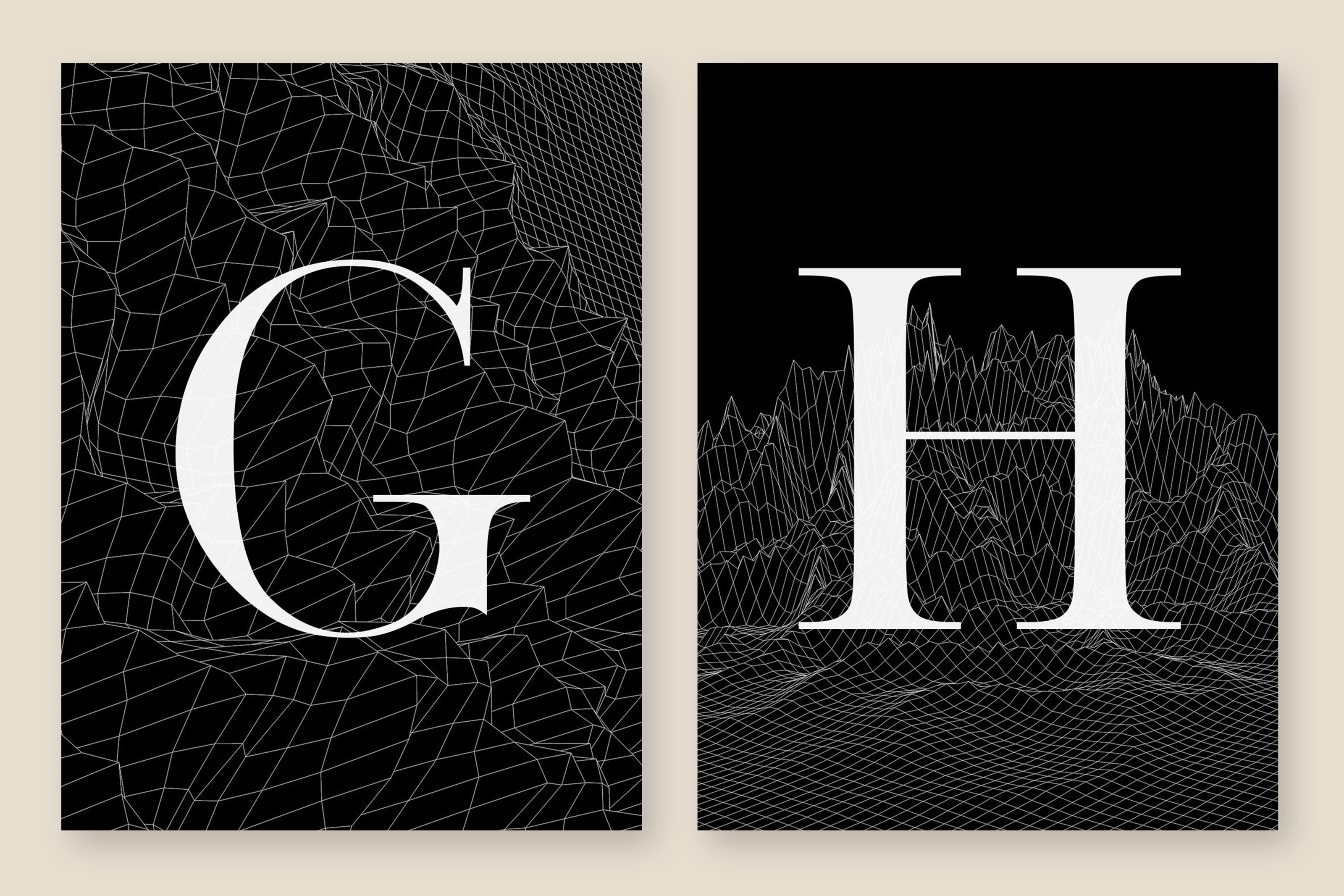
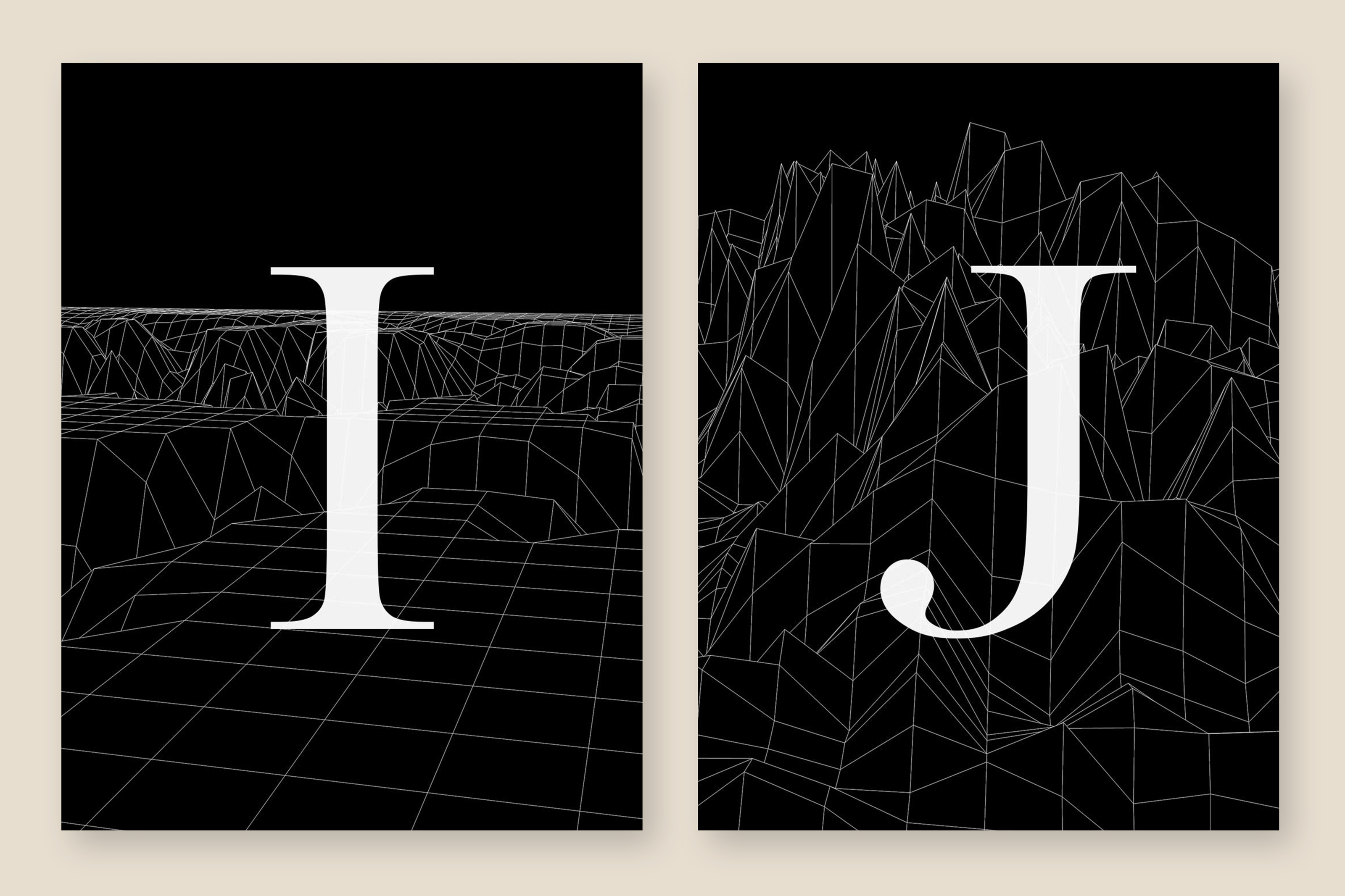
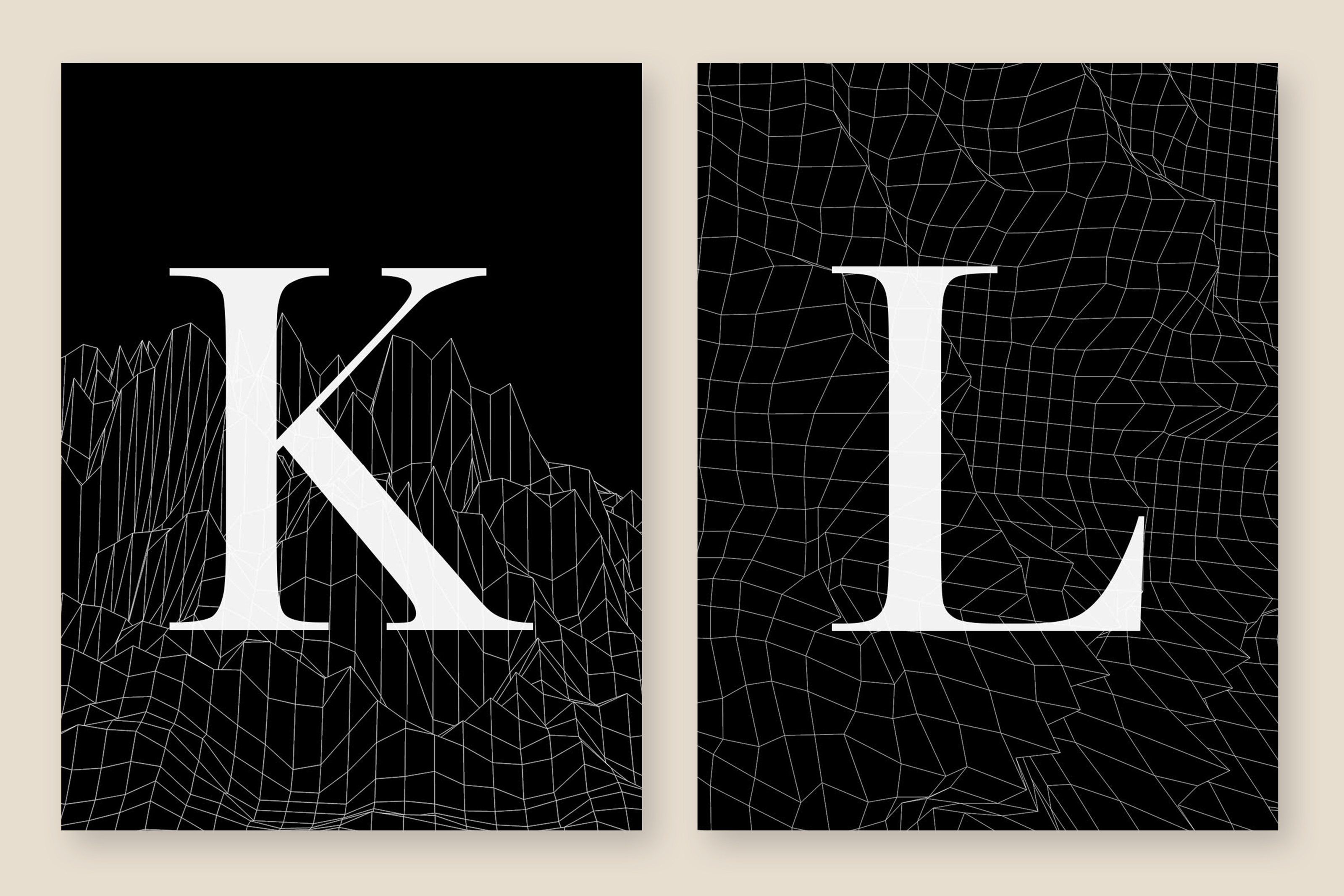
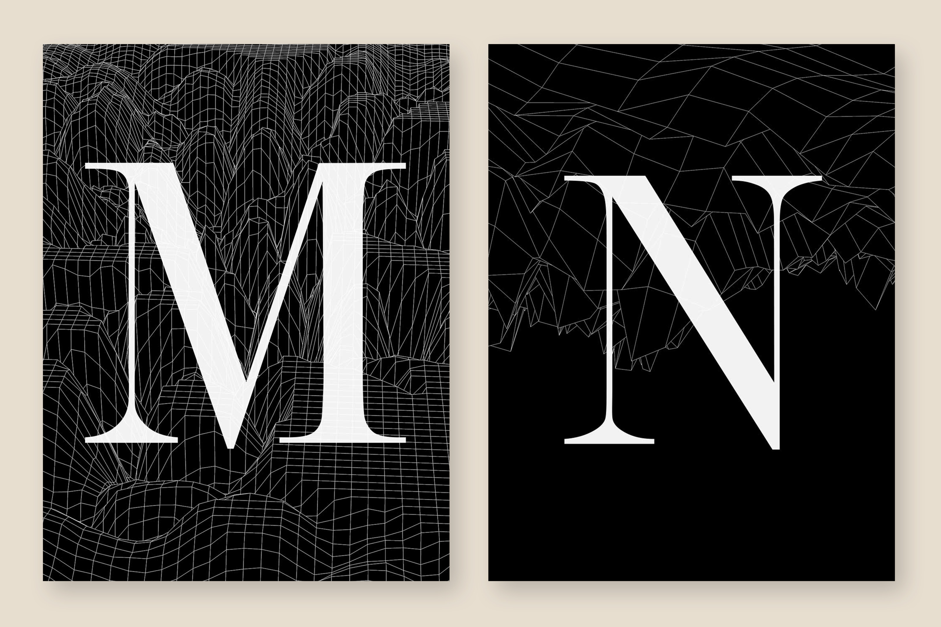
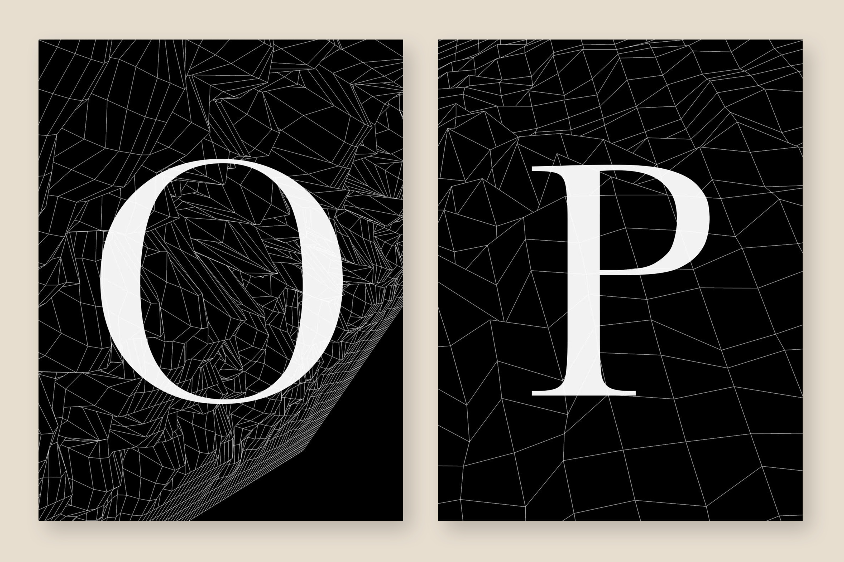
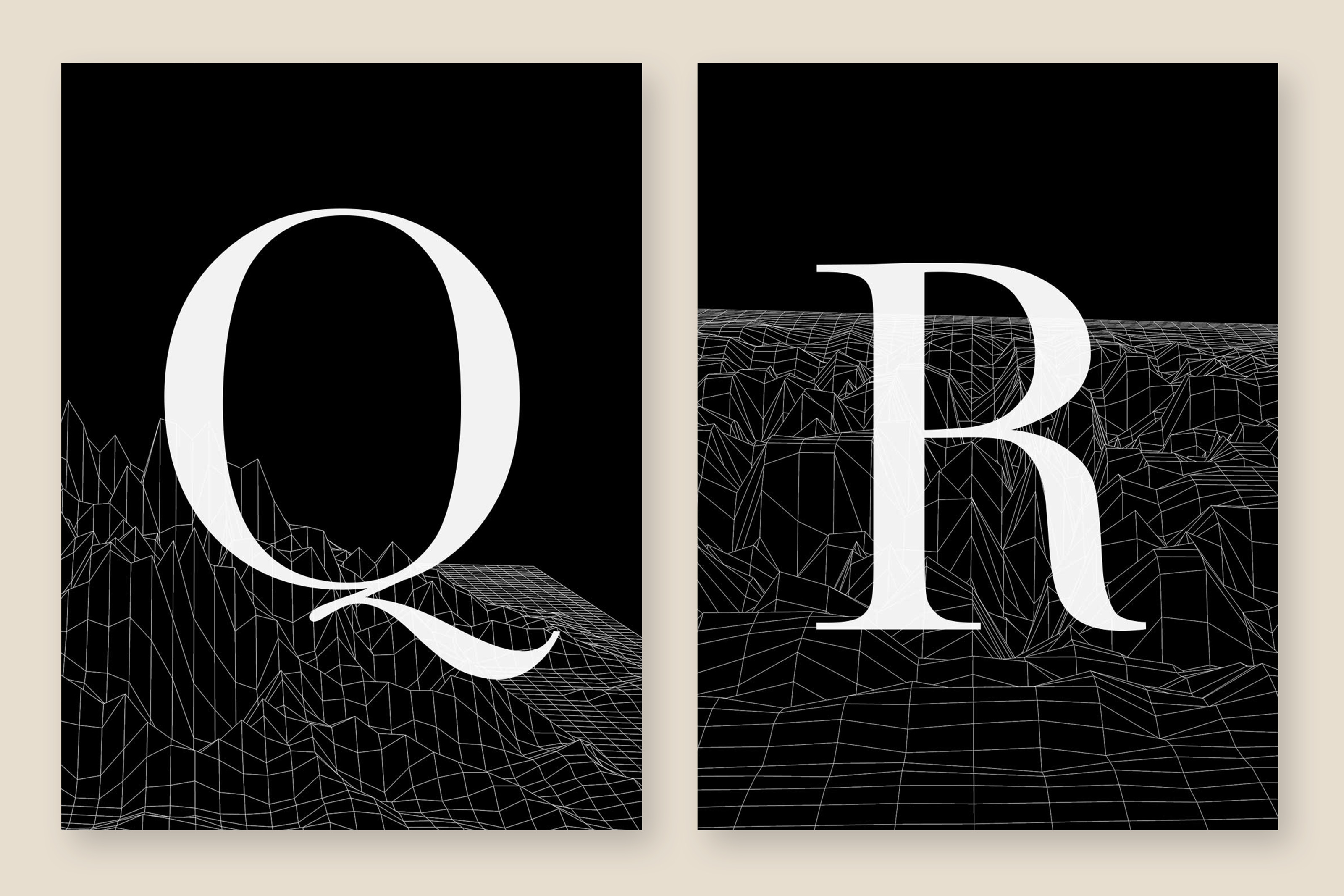
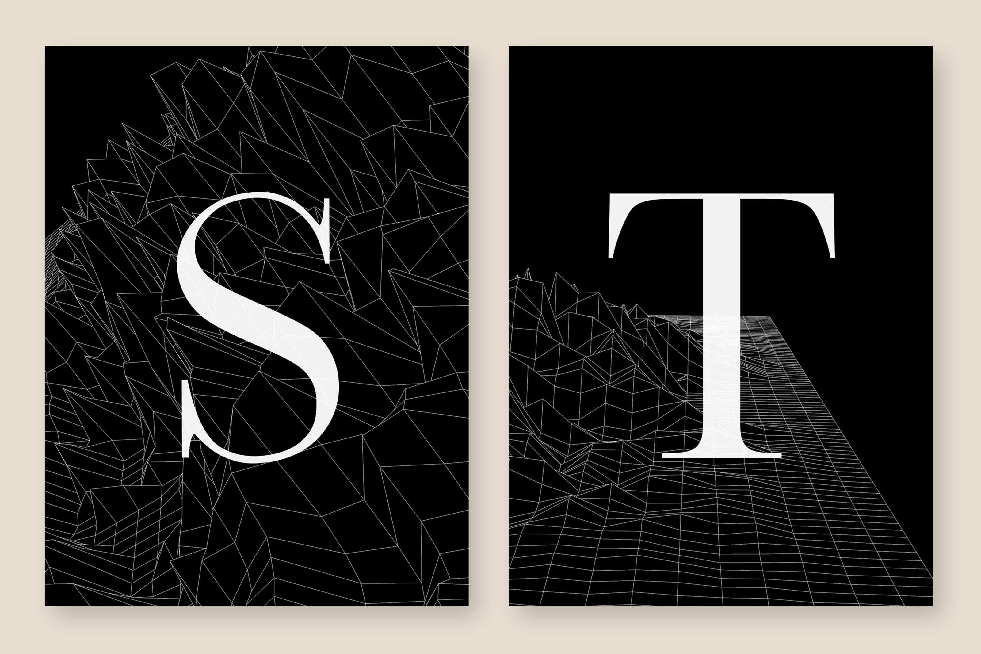
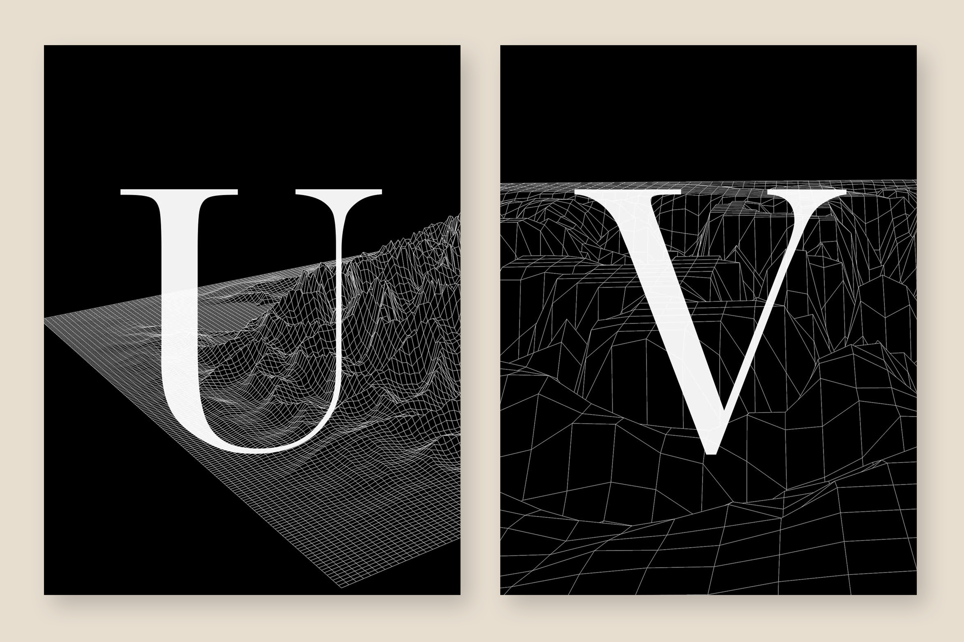
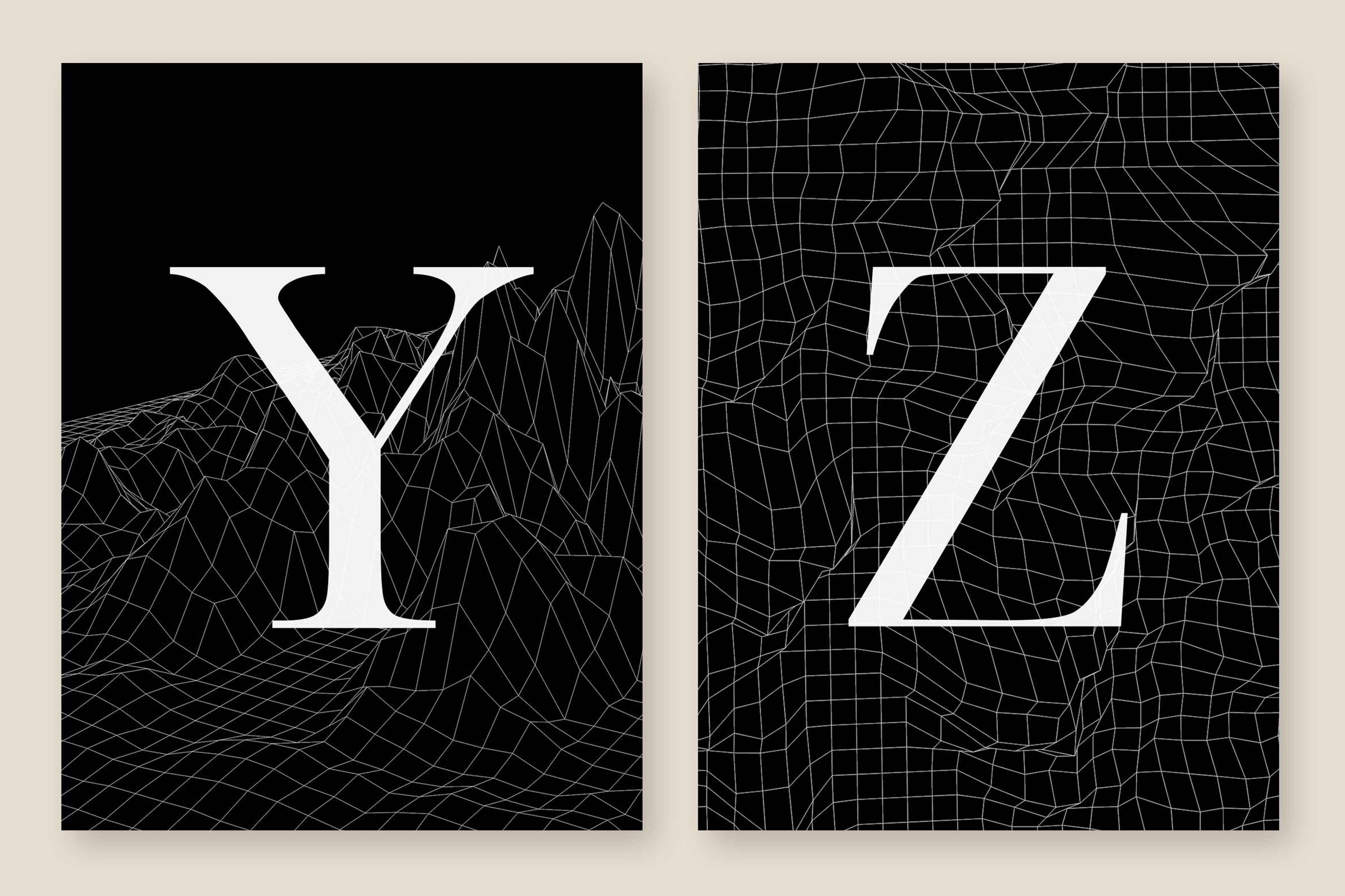
A friend of mine did 26-days of type challenge where she hand illustrated a font and shared one letter from the set everyday. It inspired me to create the font of my dreams, John Dot, a perfect combo of my go-to headline fonts; Didot and Baskerville.
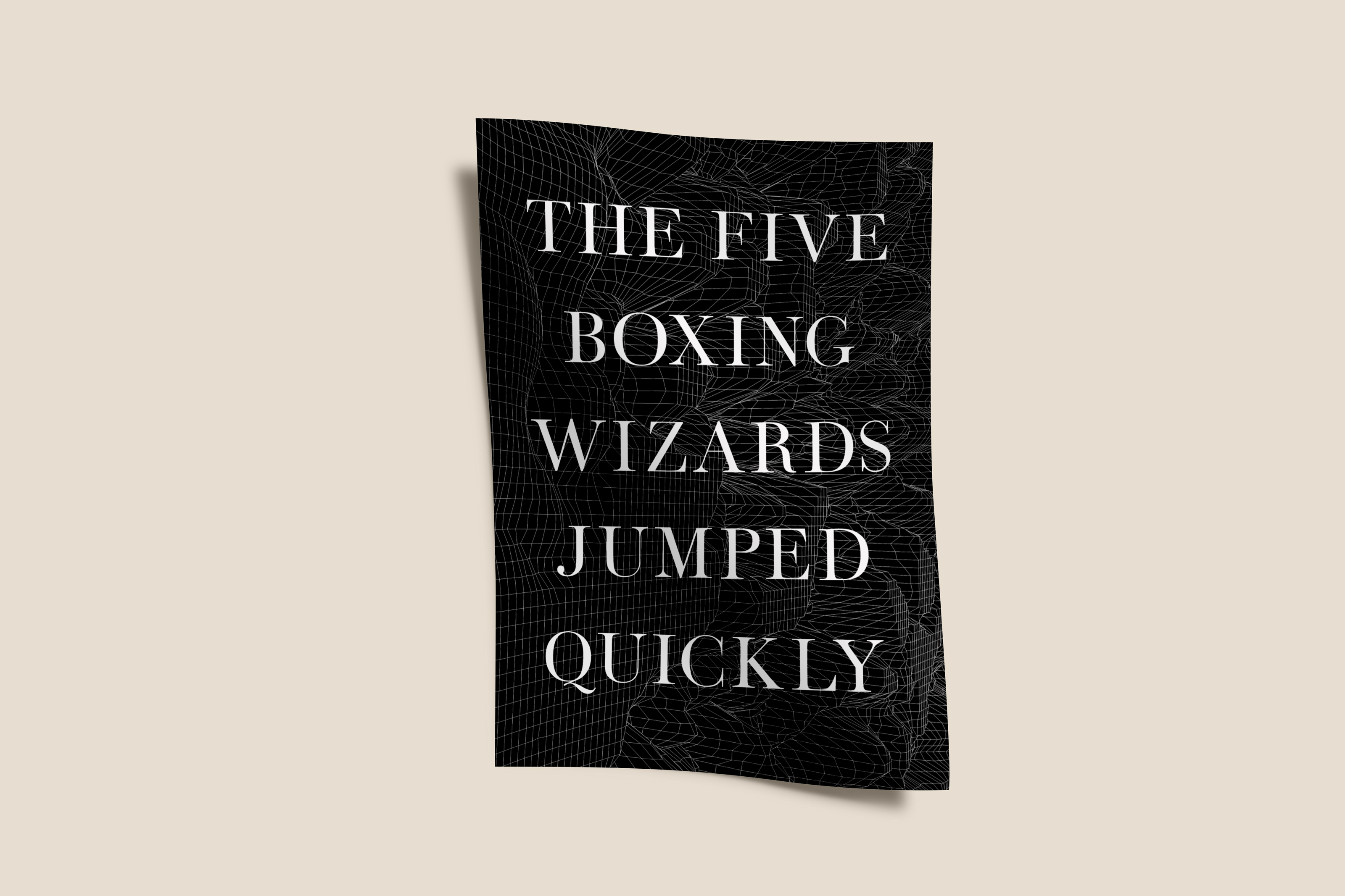
John Dot takes the harsh edges of the Didot slabs and the contrasting strokes of Baskervilles serifs with the delicate lines found in Didot. This no-name font incorporates the namesakes of the original font designers John Baskerville and Firmin Didot into a puny font name.


More work to be seen here.

Inventables Email Strategy

Bucketfeet Rebrand

The Sketchbook FW16